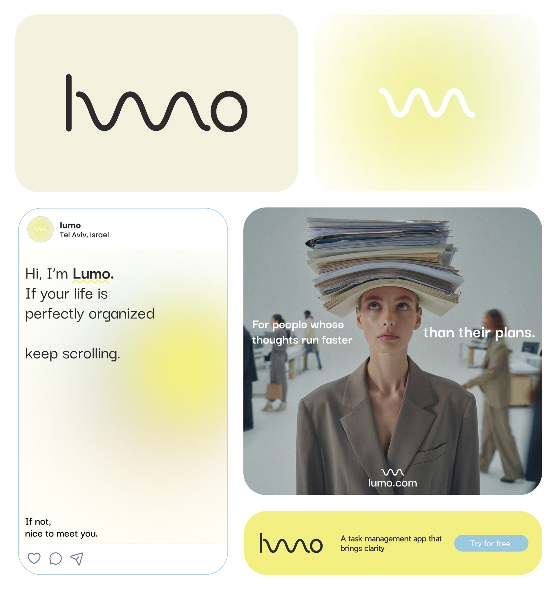

Brand Identity Lumo is an AI task management company built for people whose thoughts move faster than their plans. The starting point of this project wasn’t features or interfaces, but a very familiar state of mind: mental overload. Too many thoughts, tasks, and priorities competing for attention and not enough structure to hold them. The challenge was to design a brand that reflects clarity and organization without feeling rigid, heavy, or demanding. This wasn’t about productivity as performance, but about making organization feel lighter, calmer, and more approachable. The approach The visual identity was built around softness, simplicity, and restraint. A minimal system, generous whitespace, and a warm, subtle color palette were used to reduce visual noise and create a sense of calm. The identity avoids sharp contrasts or aggressive productivity cues, allowing the brand to feel supportive rather than controlling. The logo and graphic language reference movement and flow reflecting how thoughts naturally move while the system around them provides structure and order. The goal was not to slow people down, but to give their fast-moving thoughts a place to land. The result A brand that communicates clarity through simplicity. Structured, but never rigid. Calm, but still functional. The identity supports Lumo’s core idea: you bring everything that’s on your mind, and Lumo does the organizing turning mental clutter into a clear, workable day.