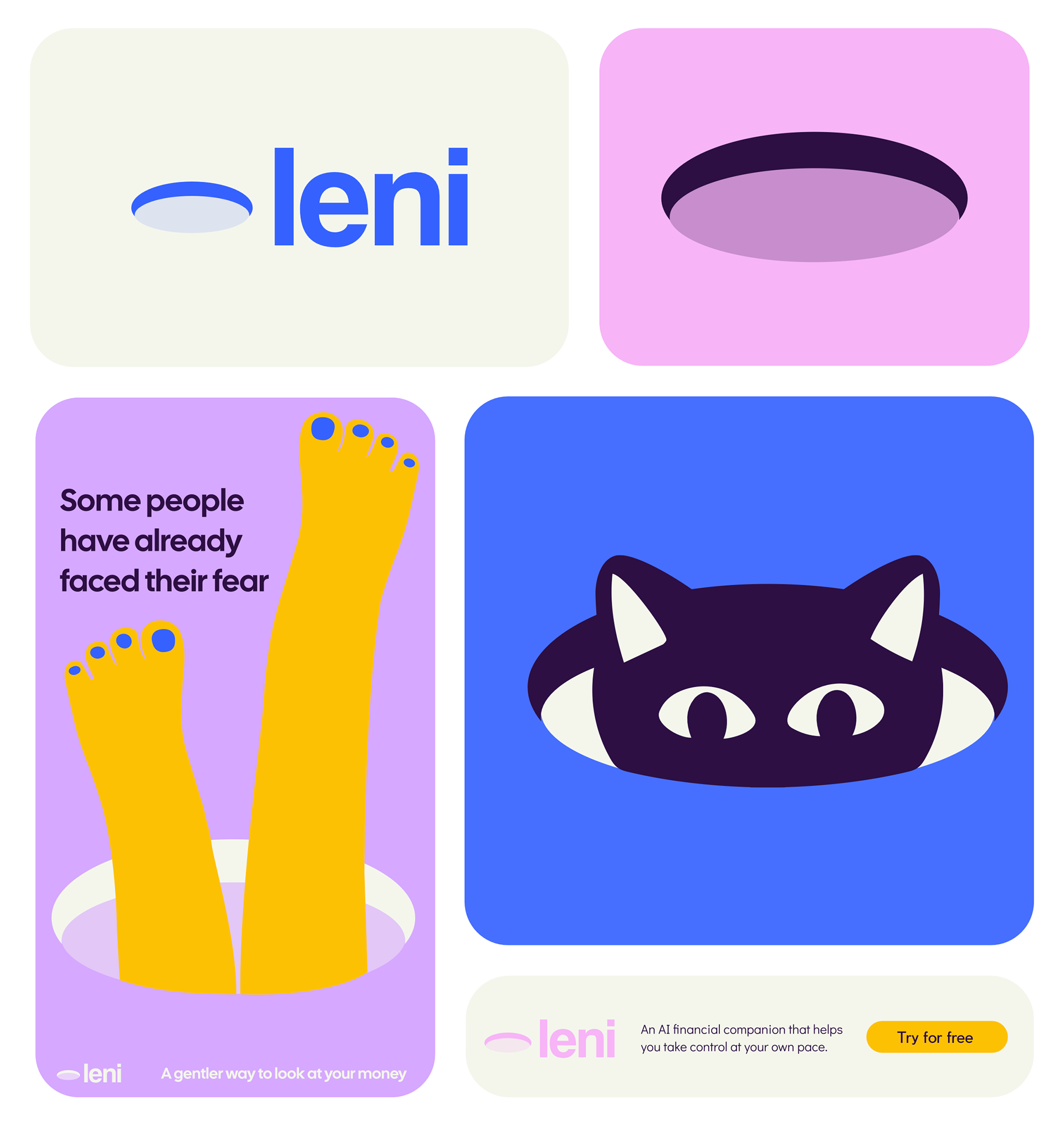
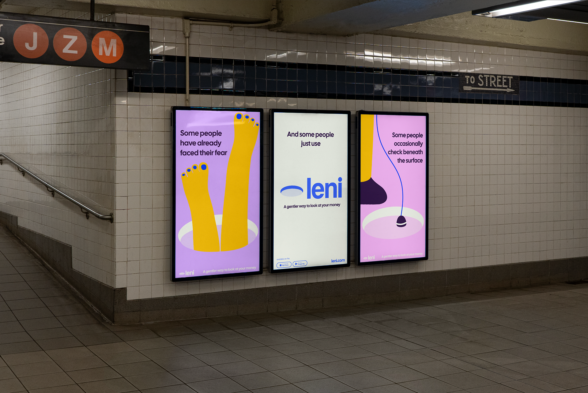

Brand Identity & Campaign System Leni is an AI-powered financial companion designed to help people look at their money without pressure or judgment. The identity is built around a simple metaphor: For many people, a bank account feels like a hole in the ground. Instead of treating it as something dark or dramatic, the brand reframes it as a neutral space one that people approach differently. Visual Language- The “hole” became the core graphic device of the system. It appears repeatedly across touchpoints sometimes as a static symbol, sometimes as an interactive space, and sometimes as a narrative element in the campaign. The illustration style is flat and bold:No texture,No gradients, No unnecessary detail, Clear geometric shapes and Strong contrast. Color Strategy- The palette balances emotional tension and safety. Vibrant yellow and purple and pink create energy and visibility. Deep blue anchor the brand in trust and stability. Soft neutrals create breathing space. Verbal Tone- The copy is observational and non-judgmental. Short, simple statements